Lesson 3: Modeling Trade-Offs with Utility
You’ve now learned how to use the spatial model, along with Poole’s and Rosenthal’s NOMINATE technique to model variation in the severity of polarization in groups that make decisions through voting. On the basis of their voting records, you’ve seen the NOMINATE model’s depiction of the U.S. House of Representatives, in which both policy polarization and partisan divergence have increased steadily since the 1970s. The NOMINATE model depicts the U.S. House as of 2021 as starkly polarized, with legislators’ ideal points clustered tightly at each of two poles, and a wide gap separating the left-most Republican ideal point from the right-most Democratic ideal point.
What caused policy polarization and partisan divergence in the U.S. House to become so pronounced? In this lesson, you’ll learn about an exploration of the causes of polarization in the U.S. Congress by political scientist Andrew B. Hall. (Hall 2019) Hall uses the spatial model and a number of other PPT tools to model processes that might be responsible for the apparent increase in polarization in both the House and Senate since the 1970s.
In order to understand Hall’s work, you’ll learn an additional tool used widely in Positive Political Theory: Utility Representations of Preferences. Utility representation are especially useful for modeling political process that emerge from the choices persons make when they face trade offs between competing priorities.
Selection and Control
The U.S. House has 435 voting seats. Each seat represents one legislative district, each of which contains several hundred thousand residents. Every two years, elections in each district determine that district’s representative until the next election. The two-year frequency of House elections suggests that they play a central part in whatever mechanisms are generating polarization among House members. At any one moment, after all, the group of persons who happen to be House members is nothing more or less than those installed in office by elections that took place at most two years prior. Thus instead of looking at the House at any one moment and remarking “wow, the members of the House are polarized!”, one might just as well say “wow, the most recent House elections delivered a polarized House!”
Quantitative and qualitative surveys since the seminal work of Richard Fenno (1978) consistently demonstrate that House members devote a large proportion of their time working to secure their retention in the next election, which is never more than 24 months away. Hall vividly illustrates this with an anecdote reported by online magazine Huffington Post in which newly elected Democratic House members are instructed by staff from the National Democratic Campaign Committee that in their roles as House members they should set aside four hours of every workday for “call time”, during which they will make phone calls soliciting the donations they will need for successful re-election campaigns. (Grim and Siddidqui 2017; cited by Hall 2019, 1) Presumably, if the re-election incentive is strong enough to get House members to devote hours to fundraising every working day, it is also strong enough to shape their voting patterns, and thus the policy positions they appear to pursue through their votes.
To understand how political scientists explore the connection between House elections and polarization, it helps first to be aware of two distinct perspectives on how elections might drive the patterns of behavior we see among elected officials. The first is the selection perspective. This perspective notes that elected officials’ behaviors in office might be driven in part by individual-level characteristics that do not change or that only change slowly. For instance, a House member’s patterns of voting might be driven in part by her expertise (or lack thereof) in certain aspects of public policy or law, her past experiences, her moral values or ideology, her personality traits, or the worldviews and commitments that emerge from her racial, ethnic, gender, class, religious and ethnic identities. To the extent that such fixed traits shape elected officials’ behaviors, elections might shape the patterns of behavior we observe in elected bodies by selecting persons with certain traits over others. More precisely, it might be that persons with certain traits are systematically more likely to become candidates for office than others, and that candidates with certain traits are systematically more likely to win elections.
In contrast, the control perspective on elections takes note of the fact that, whatever fixed traits they may have, elected officials choose how to cast their votes and how to exercise the other powers of their offices. Thus voters might be able to some extent to control elected officials’ choices by rewarding some choices with votes and punishing other choices by casting votes for competitors. In the control perspective then, the patterns of behavior exhibited by elected officeholders may emerge from the combination of elected officials’ desire for re-election and voters’ tendencies to reward or punish incumbent candidates running for re-election on the basis of their records in office.
The selection and control perspectives are by no means mutually exclusive. Instead, they are complementary conceptual tools, each of which can be used to help develop and articulate hypotheses about the mechanism driving the behaviors of elected officials. Those behaviors, after all, emerge from the aggregation of actions by many persons acting in an extraordinarily diverse variety of circumstances. It would be absurd to imagine that only selection or control drives any pattern of behavior by all members of the House.
Andrew Hall’s study attempts to articulate and explore how electoral selection, as opposed to control, might contribute to the severe polarization of the U.S. Congress. At the outset of his book, he notes that electoral control perspectives on polarization are widespread and well-understood. Commentators often presume that members of Congress behave in highly partisan ways and vote in favor of extreme issue positions because they anticipate that doing so will be rewarded by voters in the next election. Hall argues that our grasp of polarization can be improved if, in addition to considering electoral control, we also explore the role of selection in polarization.
More specifically, Hall’s study explores the implications of two possibilities. First, a potential member of Congress’s tendency to take extreme positions and refuse to cooperate with members from the other party if she gains office might to some extent be a fixed trait – one that will govern her behavior in office regardless of electoral pressures from voters in her district. Second, if the tendency to behave in polarized ways is a fixed attribute of potential members of Congress, then the polarization of the U.S. House might largely be due to “who wants to run”. More specifically, it might be that persons with more extreme policy views and more rigid partisan attachments are systematically more likely to run for office than persons with moderate views on policy and willingness to cooperate with members of the other party.
Elections as Filters
U.S. House districts are quite populous. For instance, the U.S. Census estimates that New York’s twenty seven congressional districts in 2020 ranged in population from about 530,000 adults to about 640,000. Almost every adult U.S. citizen residing in any one Congressional district, moreover, is legally eligible to run in any election for that district’s House seat and take office if they win the election. Thus, House elections amount in effect to a sequence of filters: Somehow, every two years, in each of the nation’s 435 House districts, an election winnows a group of hundreds of thousands of persons that each could win that district’s seat down to just one person who actually does win the seat.
More specifically, think of the one person who wins the House seat representing any given district in any given election as having passed through two distinct filters: First, they’ve passed through a filter that determines which of the hundreds of thousands of eligible residents of the district will declare themselves a candidate and run for the seat. Second, they’ve passed through a filter that determines which of whatever number of persons passed through the first filter wins the election.
For instance, the U.S. Census estimates that in 2014, about 550,000 adults lived in New York’s 4th Congressional District, one of several districts on Long Island, to the East of New York City. Data collected from the Federal Election Commission by political scientist Adam Bonica (Bonica 2014a) identifies 6 persons who passed through the first filter and ran as candidates for the House seat representing the 4th district in the 2014 election. Their names were Kevan Abrahams, Carolyn McCarthy, Kathleen Rice, Francis X. Becker, Jr., Bruce Blakeman and Frank Scaturro. Of those six persons, one, Kathleen Rice, passed through the second filter and won the seat representing New York’s 4th district. So, the 2014 election for New York’s 4th House district, operating as a sequence of two filters, looks like this:
Thinking of House elections as filters helps us to imagine two possible mechanisms that might be at the root of the U.S. House’s polarization. Take a look at the locations of the ideal points, depicted by the NOMINATE model, of the members of the House who served in 114th Congress. These are the persons who passed through both of the two filters at work in each of the U.S.’s House districts in the 2014 elections, winning seats that they held from January 2015 through December of 2016.
When we think of these persons as the subset of persons who passed through each of the two filters in their districts’ elections, the question “why was the U.S. House so polarized in the 114th Congress?” takes on a new form: “Which of the two filters stopped the moderates?”; Or, more precisely: “Which of the two filters stopped the persons who would, if they had won House seats, have voted as if their ideal points were located in the middle of the space, between the two polarized clusters of ideal points that resulted from the 2014 elections?” After all: had the filters in those elections stopped some of the persons with extreme policy views and rigid partisan attachments from winning seats, and in their stead installed persons apt to support moderate policies and vote in coalitions with persons in the opposite party, the 114th Congress would not (at least as represented by the NOMINATE model) have been so polarized.
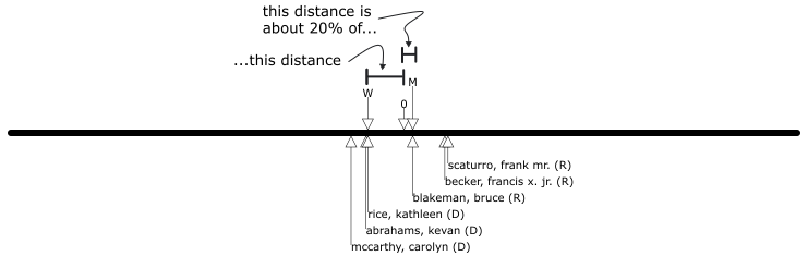
Andrew Hall explores the filtering-out of moderates in House elections by using yet another version of the spatial model developed by political scientist Adam Bonica (Bonica 2014b), called the Campaign-Space Campaign Finance Scores model, abbreviated as ‘CFscores’. While the NOMINATE model depicts persons’ ideal points on the basis of the votes they cast in a legislative chamber, the CFscores model instead depicts ideal points on the basis of campaign contributions. U.S. federal law requires all candidates for federal office to report the donations their campaigns received, along with the name and address of each donor and the amount that donor contributed. The CFScores model in effect assumes that every campaign donor and every candidate for federal office has single-peaked preferences over policy, and that any given donor’s likelihood of donating to any given candidate increases as the ideal points of the donor and candidate get closer to one another. Under this assumption, the federal records of who donated to whom can be taken to imply a location of an ideal point for every candidate for federal office in recent history, along with a location of an ideal point of every donor who made a contribution in any recent federal election. Thus the CFscores model gives us a depiction not only of the policy preferences of members of the U.S. House, but also of every person who has run for the U.S. House. For instance, the diagram below shows the ideal points as modeled by the CFscores model of the six candidates for the House seat representing New York’s 4th District in the 2014 election.1
Hall notes that the CFscores model locates the ideal points of every candidate for federal office relative to a common central location in the policy space. We’ll call this location the “0-point”, and will indicate its location in every diagram going forward with an arrow labeled “0” that points to its location in the space, like so:
Once we’ve located the central 0-point in the space, we can then identify the most-moderate candidate in any given election – i.e. the candidate whose ideal point as modeled by the CFscores model is closest to the 0-point. Going forward, we’ll point to this most-moderate candidate’s ideal point with an arrow labeled “M”, like so:
As you can see in the above diagram, in the 2014 election for the seat representing New York’s 4th Congressional district, the most moderate candidate in the race as modeled by the CFscores model was Republican Bruce Blakeman.
Hall’s insight is that the proximity of the most-moderate candidate’s ideal point to the 0-point relative to the proximity of the winning candidate’s ideal point to the 0-point gives us a sense of the relative contribution to polarization of each filter. To see how, label the ideal point of the candidate who won the seat for New York’s 4th Congressional District in 2014, Democrat Kathleen Rice, with a “W” like so:
Notice that in this election, the second filter – i.e. the one that picks which of the persons who run as candidates actually wins the seat – selected a less moderate candidate, Kathleen Rice, over a more moderate one, Bruce Blakeman. So, in this sense, the second filter increased polarization in the U.S. House during the 114 Congress over and above what was otherwise possible.
What about the first filter – i.e. the filter that determines which of the hundreds of thousands of persons eligible to run for and win a district’s seat enter the race as candidates? To understand how Hall evaluates the contribution of the first filter to polarization in the House, it’s useful to compare the arrays of ideal points of candidates for two different House seats. The following diagram shows the ideal points of the candidates in the 2014 election for the New York’s 4th District just above the ideal points of the candidates in the 2014 election for New York’s 18th District, a mostly rural district which stretches across the Hudson Valley from the cities of Newburgh and West Point in the East over to the Catskill Mountains in the West.
In 2014, the second filter kept the 18th District’s most moderate candidate, Republican Nan Hayworth, out of office, just as kept the most moderate candidate out of office in the 4th District. However, there was a critical difference between these two races. Notice how much closer 4th District candidate Bruce Blakeman is to the 0-point relative to 4th District winner Kathleen Rice than 18th District candidate Nan Hayworth is to the 0-point relative to 18th District winner Sean Maloney. The distance from Bruce Blakeman’s ideal point to the 0-point appears to be about 20% of the distance from Kathleen Rice’s ideal point to the 0-point. The distance from Nan Hayworth’s ideal point to the 0-point, on the other hand, is only about 50% of the distance from Sean Maloney’s ideal point to the 0-point. It looks like this:
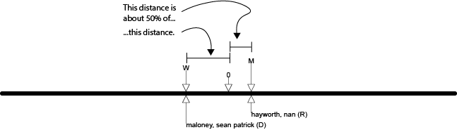
Thus the first of the two filters – again, the filter that determines which of the eligible persons in a district enter the race as candidates – created two very different possibilities in these two districts. In the 4th District, a candidate got into the race who was very close to the 0-point relative to the ultimate winner. Most-moderate candidate Bruce Blakeman didn’t make it through the second filter. But because he was so much more moderate than Kathleen Rice, his presence in the race meant that the scope of reductions in polarization that that election could have produced was relatively large. In the 18th District, in contrast, the most-moderate candidate was much less close to the 0-point relative to the ultimate winner than was Bruce Blakeman relative to Kathleen Rice.
Of course, those are just two races out of 435 that occur every two years. Hall uses the CFscores model of every election between 1980 and 2010 in every one of the House’s 435 districts to assess the relative contributions of the first and second filters to polarization more generally. He compares the distance between the mean Republican House member’s ideal point and the mean Democratic House member’s ideal point resulting from each of those elections to the distance between these mean ideal points that would have occurred had the most-moderate candidate won every election in every district. In effect, his analysis amounts to a model of the level of polarization that would have occurred in the House during the 1980-2010 period if the second of the two filters always selected the most-moderate candidate.
Here’s an image from Hall’s book, (Hall 2019) showing the result of his simulation:
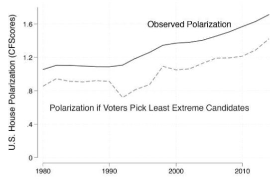
The solid line, labeled “Observed Polarization” tracks the distance between the mean Republican House member’s ideal point and the mean Democratic House member’s ideal point over time. The dotted line shows the distance between the Republican and Democratic mean ideal points that would have obtained in the House in the hypothetical alternative scenario in which the most-moderate candidate won in every district in every election between 1980 and 2010.
Necessarily, the dotted line is lower than the solid one, since in the alternative scenario it depicts, every winner of every election has an ideal point closer to the center of the policy space than the person who actually won. The real question is: How much lower is the dotted line than the solid one? Did enough sufficiently moderate persons run in House elections (i.e. did enough sufficiently moderate persons make it through the first filter) during the 30-year period of the simulation to make a substantial reduction in the House’s polarization possible?
Hall thinks not. Here’s how he interprets the chart: (Hall 2019, 15)
According to the simulation, roughly 20 percent of the overall polarization in the House is due to choices voters make among the candidates who run for office. The other 80 percent of polarization exists no matter which candidates voters choose from among the existing pool – it is already baked into the set of people who run for office!
In other words, a substantial portion of polarization in the House may be due to the first filter in House elections. Even if the second filter reliably selected the most-moderate candidate for office in every election, the most moderate persons who make it through the first filter are still quite extreme. Thus polarization in Congress may be driven in large part by, to use Hall’s phrase, “who wants to run”: Not enough persons inclined to support moderate policy positions and collaborate with persons from the opposite party if they win office run for Congress in the first place.
Pause and complete check of understanding 1 now!
Trade-offs
Hall’s approach, then, quickly yields fruit. It directs our attention to a possibility that we might not otherwise have considered: Perhaps a major determinant of the House’s polarization is “who wants to run”. Hall’s study explores this possibility by developing a model in which persons who are inclined to support moderate policies if they win office are systematically less likely to run for office than are persons inclined to support extreme policies. In what follows in this lesson, we’ll walk through the process of building a PPT version of Hall’s model, learning the required PPT tools along the way. We’ll start by introducing the ideas about persons’ choices to run or not run for office that Hall’s model explores.
Hall begins with the observation that campaigning for office is time consuming. The candidate must create a campaign organization, recruit and manage staff and volunteers, appear at events in-person and online, maintain an active social media presence, solicit donations, participate in political debates, respond to questions from journalists, and produce advertisements for print, TV and the web. In competitive races, the time commitment required of the candidate for her to have even a small chance of victory amounts to at least that of a full-time job. Persons who work for a living and wish to run for office, then, must either forgo paid work to do so, or add what amounts to a second unpaid job on top of their “day job”, leaving very little spare time for parenting, maintaining personal relationships, and caring for one’s physical and mental health. On top of the demands on one’s time, persons who run for office make themselves the object of widespread attention in print media, on TV and on the web. Most persons find the resulting scrutiny – directed at both themselves and their family members – stressful, as it inevitably involves some amount of public exposure of personal details and invites harassment, trolling, abuse and even threats of violence.
Yet, every election year, thousands of persons run for seats in the House. Adam Bonica’s data (Bonica 2014a), for instance, identifies 1,484 persons who ran for a seat in the 2014 elections. Presumably, these persons run in pursuit of some benefit that they find worth the substantial costs one must pay to be a candidate. Hall’s approach explores the role of one possible benefit: Potential candidates for office care about the policies pursued by whoever wins the seat representing their district. So if a potential candidate disagrees with the policy views of all the candidates running to win her district’s seat, she might be willing to run against them in hopes of winning the seat and thus gaining the power to advance what she sees as better policy.
It’s critical to notice that these two ideas together – i.e. that potential candidates bear substantial personal costs if they run for office, and that potential candidates see winning office as a way to cause policies to align with their own views – imply that the decision to run for office entails a trade off between a person’s policy priorities and other domains of her life. Specifically, a person deciding whether to run for office must weigh the personal costs entailed in being a candidate against the value of the changes to policy she could effect if she were to run and win. To explore the implications of these ideas in a PPT model, then, we’ll need tools well-suited to depict trade-offs like this one. So the following sections will introduce a set of tools which, used in concert with one another, are excellent for modeling situations in which persons navigate trade-offs between their concerns for policy and other domains of their lives.
Tools for Trade-Offs
The Numerical Spatial Model
So far in these lessons, you’ve seen policies and policy preferences modeled using a purely graphical version of the spatial model, in which policies and ideal points are depicted by drawing points and lines. Whatever their other merits, graphical spatial models are not well-suited for modeling trade-offs. To model trade-offs that involve policy preferences, we typically use numerical, rather than graphical, spatial models.
A numerical spatial model represents a policy’s location in a policy space is represented by a number. For instance, a numerical spatial model would depict the locations of a set of alternative policies towards abortion as a set of numbers, like this:
- “Illegal under all circumstances” located at 4.
- “illegal during the first trimester of pregnancy and legal thereafter” located at 0.
- “legal under all circumstances” located at -10.
Since numbers can be represented as points on a line, a numerical spatial model like this one can, of course, be depicted visually:
If in reaction to this diagram, you’re wondering whether there is any important difference between the numerical and graphical spatial models, then you correctly understand what we’ve done so far. The only thing the numerical spatial model does that the graphical spatial model does not do is identify each policy with a particular number.
Utility Representations of Preference
Once we have a numerical spatial model of a policy issue, we can turn to depicting persons’ preferences over policies towards that issue. Numerical spatial models use utility representations to depict persons’ preferences.
For instance, suppose we want to use a utility representation to depict the idea that a person – let’s call her Marit – has the following preferences over three policies towards abortion:
- Marit prefers “legal only during the first trimester” to “legal under all circumstances”.
- Marit prefers “legal only during the first trimester” to “illegal under all circumstances”.
- Marit prefers “legal under all circumstances” to “illegal under all circumstances”
One utility representation that represents those preferences assigns Marit:
- Utility level 10 at “legal only during the first trimester”;
- Utility level 5 at “legal under all circumstances”;
- Utility level 3 at “illegal under all circumstances”.
The utility levels above represent Marit’s preferences because they are ordered in a way that reflects her preference orderings over the alternatives. Specifically:
- Marit prefers “legal only during the first trimester” to “legal under all circumstances”. Her utility level at the former is set to 10 and at the latter is set to 5, thus since 10>5, those utility levels represent her preference ordering over those two alternatives.
- Marit prefers “legal only during the first trimester” to “illegal under all circumstances”. Her utility level at the former is set to 10 and at the latter is set to 3, thus since 10>3, those utility levels represent her preference ordering over those two alternatives.
- Marit prefers “legal under all circumstances” to “illegal under all circumstances”. Her utility level at the former is set to 5 and at the latter is set to 3, thus since 5>3, those utility levels represent her preference ordering over those two alternatives.
Pause and complete check of understanding 2 now!
Utility Functions
The preceding example shows how a utility representation of preferences works in a very simple case in which a person’s preferences are defined over only three alternatives. But for most applications, a model that only depicts a handful of alternative policies isn’t sufficient. More to the point, policies represented in a spatial model can be located at any of the infinite number of points in the policy space. Thus, in spatial models, we cannot represent a person’s preferences by simply listing all the available policy locations and stating the utility level assigned to each one. So to specify a person’s utility level at each of every possible policy in the spatial model, we use a utility function.
For example, in the spatial model each policy has a location. So, we can represent a person’s preferences over policies in a spatial model with a utility function that assigns a utility level for that person from each policy on the basis of each policy’s location. For instance, consider again our numerical spatial model of abortion policy:
Notice that this model orders policies from left to right according to the extent to which they restrict the circumstances under which a person may terminate a pregnancy. With this in mind, imagine a person who always prefers more restrictive to less restrictive policies. A utility representation of this person’s preferences would assign higher utility levels to policies at higher locations and lower utility levels to polices at lower locations. So, one utility function that would represent this person’s preferences would take the location x of any given policy and assign utility level 10 \times x to that policy.
Here are a few more examples:
Pause and complete check of understanding 3 now!
The Tent-Shaped Utility Function
The tent-shaped utility function is often used in combination with the numerical spatial model to represent single-peaked policy preferences. Imagine a person who has single-peaked preferences over a given policy issue. Suppose we model this issue using the numerical spatial model, so that every possible policy towards the issue has a location given as a number x. Let I be the number representing the location of the person’s ideal point. The tent-shaped utility function represents this person’s preferences by assigning a utility level to any given policy with location x given by: U(x;I) = \begin{Bmatrix} x - I & \text{if} & x \leq I \\ I - x & \text{if} & I < x \end{Bmatrix} or, equivalently, U(x;I) = - | x-I | where |\ | is the absolute value operator – i.e. |y| = y if y \geq 0 and |y| = -y if y < 0.
This utility function is called “tent-shaped” because of the shape of the graph produced when we plot the utility level it assigns at each of a range of locations on either side of the ideal point. For instance, here is the graph of the utility level assigned by the tent-shaped utility function for a person with ideal point I = -1.2 at policy locations x ranging from -4 to 4:
Having graphed the utility levels given by the tent-shaped utility function for a person with a given ideal point I as above, one can use the graph to approximate the particular utility level that the tent-shaped utility function assigns at any given policy. For instance, the following graph shows the utility levels given by the tent-shaped utility function for a person with ideal point I at -1.2 at each of three policies, A at location x=-3.7, B at location x = 0.1 and C and location x = 1.9.
The dashed lines in the graph above trace the position of each policy in the policy space, which is displayed on the horizontal axis, up to the level of the utility function along the vertical axis. The level on the vertical axis of the utility function at a policy’s location is the utility level that the tent-shaped utility function assigns at that policy. Thus, examining the graph, one can see that for a person with ideal point I at -1.2, the tent-shaped utility function assigns…
- A utility level at policy A of about -2.5;
- A utility level at policy B of about -1.3;
- A utility level at policy C of about -3.1.
Recalling that a utility function represent’s a persons preferences by assigning the person higher utility levels at policies they find more preferable, one can tell from the graph above that the person whose preferences are represented by the graphed utility function has the following preference ordering over policies A, B and C:
- Prefers policy B to policy A;
- Prefers policy A to policy C;
- Prefers policy B to policy C;
Pause and complete check of understanding 4 now!
Modeling Trade-Offs
You now have the tools you need to understand and analyze models that explore Hall’s ideas about why persons with relatively moderate preferences might be less likely to run for office than persons with relatively extreme preferences. Recall once more Hall’s notion about the trade-off a person faces when she chooses whether to run for office. On the one hand, running for office entails steep personal costs in time, money and stress. On the other hand, by running one has a chance of winning the power to change policy.
To model the implications of these ideas, we’ll build a model of a potential candidate choosing between two alternatives: She can either run in an upcoming election or not run. To keep things as simple as possible, suppose there is a current candidate already running in the election, and no person other than the potential candidate will enter the race. Thus if the potential candidate chooses to not run, the current candidate will be the only candidate in the race and will thus win the election with certainty. On the other hand, if the potential candidate chooses to run, her only opponent will be the current candidate, and thus one of the two of them will win. In order to make learning this model as easy as possible, we’ll make an unsatisfying assumption about what happens when the potential candidate runs: She defeats the current candidate and wins the election with certainty. In the next lesson, you’ll learn the tools you would need to model the more realistic situation in which each candidate has some chance of winning when they both run.
With this simple depiction of an election in hand, we now turn to modeling a trade-off for the potential candidate between the personal costs she must bear to run and the policy changes she can cause by running and winning. Suppose that whoever wins the election gains the power to set policy on some issue to whatever location they desire. Using a numerical spatial model of policy, Let x (a number) be the location of policy set by whichever candidate wins. Suppose that the potential and current candidate each have single-peaked policy preferences over policy. Let 0 be the location of the potential candidate’s ideal point, and let 10 be the location of the current candidate’s ideal point. Thus, if the potential candidate runs, she wins and sets policy to her ideal point so that x = 0. And if the potential candidate does not run so that the current candidate wins, the current candidate sets policy to his ideal point so that x = 10. Here’s a summary of these assumptions…
…and a visualization:
To complete the model we need to depict the personal costs the potential candidate bears if she chooses run. To understand why we depict these costs in the way we do, it is critical to recall the core idea we want to use this model to explore: The potential candidate cares about both policy, one the one hand, and aspects of her personal life that she must give up in order to run office, on the other. Thus she faces a trade-off between her policy concerns and aspects of her personal life. Resolving any such tradeoff entails judgments about relative magnitudes. Specifically, the potential candidate must decide whether (a) the policy change she can cause by running is large enough to make the personal costs she must pay to run worthwhile or (b) the policy change she can cause by running is too small to justify the personal sacrifices running requires.
Depicting judgments about relative magnitude – e.g. “large enough” and “too small” – are exactly what utility functions are built to do. So we’ll represent the potential candidate’s preferences using a utility function. Continue to let x be the location of policy that ultimately results from the potential candidate’s choice to either run or not run. Specifically, x = 0 (the potential candidate’s ideal point) if the potential candidate runs and x = 10 (the current candidate’s ideal point) if the potential candidate does not run. Given the policy location x that results from whatever the potential candidate does, and the choice of the potential candidate to run or not run, assume that the potential candidate’s utility level is given by: -| x-0 | - \begin{Bmatrix} 5 & \text{if the potential candidate run} \\ 0 & \text{if the potential candidate does not run} \end{Bmatrix}
To understand how this utility function works, notice that it consists of two terms. We’ll call these terms the “Policy Term” and the “Cost Term”, like so: \begin{array}{ccc} \underbrace{ -|x-0| } & - & \underbrace{ \begin{Bmatrix} 5 & \text{if the potential candidate runs} \\ 0 & \text{if the potential candidate does not run} \end{Bmatrix} }\\ \text{Policy Term} & & \text{Cost Term} \end{array}
Notice that the “Policy Term” is just a tent-shaped utility function for a person with an ideal point of 0. It captures the fact that the potential candidate wants the ultimate policy that results from her choice (x) to be as close to her ideal point (0) as possible.
The “Cost Term” on the other hand, captures the idea that the potential candidate will have to sacrifice things she cares about in her personal life, such as income from a job, time with family and privacy in order to run. This term reduces the potential candidate’s utility level by 5 if she chooses to run. Why the number 5 as opposed to some other number? We’ll return to the number used to depict the cost to the potential candidate of running later. For now, the only thing that matters is understanding the structure of the utility function and how it works.
Specifically, make sure you see how this utility function depicts the trade-off the potential candidate faces between her concerns about the location of policy and the priorities in her life that must be sacrificed in order to run for office: Recall that if the potential candidate runs, she wins and sets the location of policy x to her ideal point 0. So if she runs, x = 0, and thus the Policy Term is set to 0 and her utility level is given by: \begin{array}{ccc} \underbrace{0} & - & \underbrace{5} \\ \text{Policy Term} & & \text{Cost Term} \end{array} On the other hand, if she does not run, the current candidate wins and sets the location of policy x to his ideal point 10. So if she runs, x = 10 and thus the Policy Term is set to -10 and her utility level is given by: \begin{array}{ccc} \underbrace{-10} & - & \underbrace{0} \\ \text{Policy Term} & & \text{Cost Term} \end{array}
With these two expressions lined up this way, one can see the trade-off at work. By running for office instead of not running for office, the potential candidate raises the policy term (from -10 to 0), but also raises the cost term (from 0 to 5). Whether she prefers to run or not run, then, depends on the net effect on her utility level of these two opposing consequences. Subtracting the cost term from the policy term for each possible choice, we have: \begin{array}{ccccc} \underbrace{0} & - & \underbrace{5} & = & -5 \\ \text{Policy Term} & & \text{Cost Term} \end{array} \begin{array}{ccccc} \underbrace{-10} & - & \underbrace{0} & = & -10 \\ \text{Policy Term} & & \text{Cost Term} \end{array} So, this model depicts the potential candidate getting a higher utility level (-5) from running than from not running (-10), and thus preferring to resolve her trade-off in favor of her policy concerns.
Pause and complete check of understanding 5 now!
Parameterized Models of Tradeoffs
The model above depicted the tradeoff faced by the potential candidate using three arbitrary numerical values: 0 for the ideal point of the potential candidate, 10 for the ideal point of the current candidate, and 5 for the personal cost paid by the potential candidate to run. In practice, political scientists do not use models specified using single, arbitrary numerical values. Instead, they use parameterized models. Parameterized models specify numerical values as parameters (you could also call them “variables”). Doing so allows us to explore how a model’s behavior varies with the particular numerical values used to specify it.
Since the PPT models used in actual political science are always parameterized, it’s critical to learn how to interpret and analyze parameterized models. To do so, we’ll start by parameterizing just one of the numerical values used in specifying the model above – the ideal point of the potential candidate. Here’s the new version of the model:
This parameterized specification allows us to explore how events may depend on the numerical values used to specify it. More precisely, we can explore what happens at different locations of the potential candidate’s ideal point P.
To do this, we’ll first look at the case in which the potential candidate’s ideal point is less than or equal to the current candidate’s ideal point – i.e. the case in which P \leq 10. It looks like this:
First, we’ll figure out the expression for the potential candidate’s utility level from running. If she runs, she pays the cost of running and wins the election and sets the policy location to x = P. Thus the potential candidate’s utility level is:
\begin{array}{ccccc} \underbrace{ 0 } & - & \underbrace{ 5 } & = & -5\\ \text{Policy Term} & & \text{Cost Term} \end{array}
Second, we’ll figure out the expression for the potential candidate’s utility level from not running. If she does not run, she does not pay the cost of running and the current candidate wins the election and sets policy to x = 10. Thus the potential candidate’s utility level is: \begin{array}{ccccc} \underbrace{ P-10 } & - & \underbrace{ 0 } & = & P-10\\ \text{Policy Term} & & \text{Cost Term} & & \\ \text{(recall that $P \leq 10$!)} \end{array}
So which of her available actions does the potential candidate prefer? Well, using the expressions worked out above for her utility level from each action, we have that her utility level from running is at least as high as her utility from from not running if P-10 \leq -5 Adding 10 to both sides of this inequality, it becomes P \leq 5
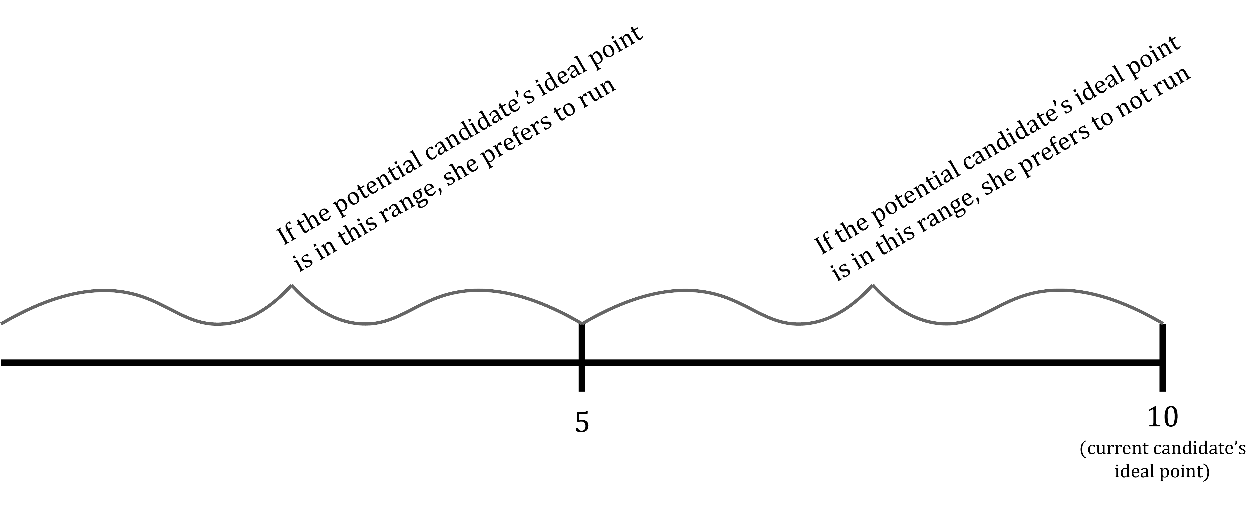
We learned something, then, by parameterizing the potential candidate’s ideal point: The model’s implications for the potential candidate’s choice between running and not running depend on the potential candidate’s ideal point. Specifically, if the potential candidate’s ideal point P is less than or equal to the current candidate’s ideal point 10, she prefers to run only if her ideal point is far enough away from the current candidate’s ideal point. It looks like this:
Pause and complete check of understanding 6 now!
So in the model in which the potential candidate’s ideal point is given by the parameter P and P \leq 10, the potential candidate prefers to run instead of not run only if her ideal point is sufficiently far to the left of the current candidate’s ideal point. In the COU linked above, you showed (if you answered it correctly) that a qualitatively similar result holds for the case where P > 10 – i.e. the potential candidate prefers to run instead of not run only if her ideal point is sufficient far to the right.
Together, the picture these two analyses paint is (roughly, omitting details that the diagram you drew in answering the previous COU should include) something like this:
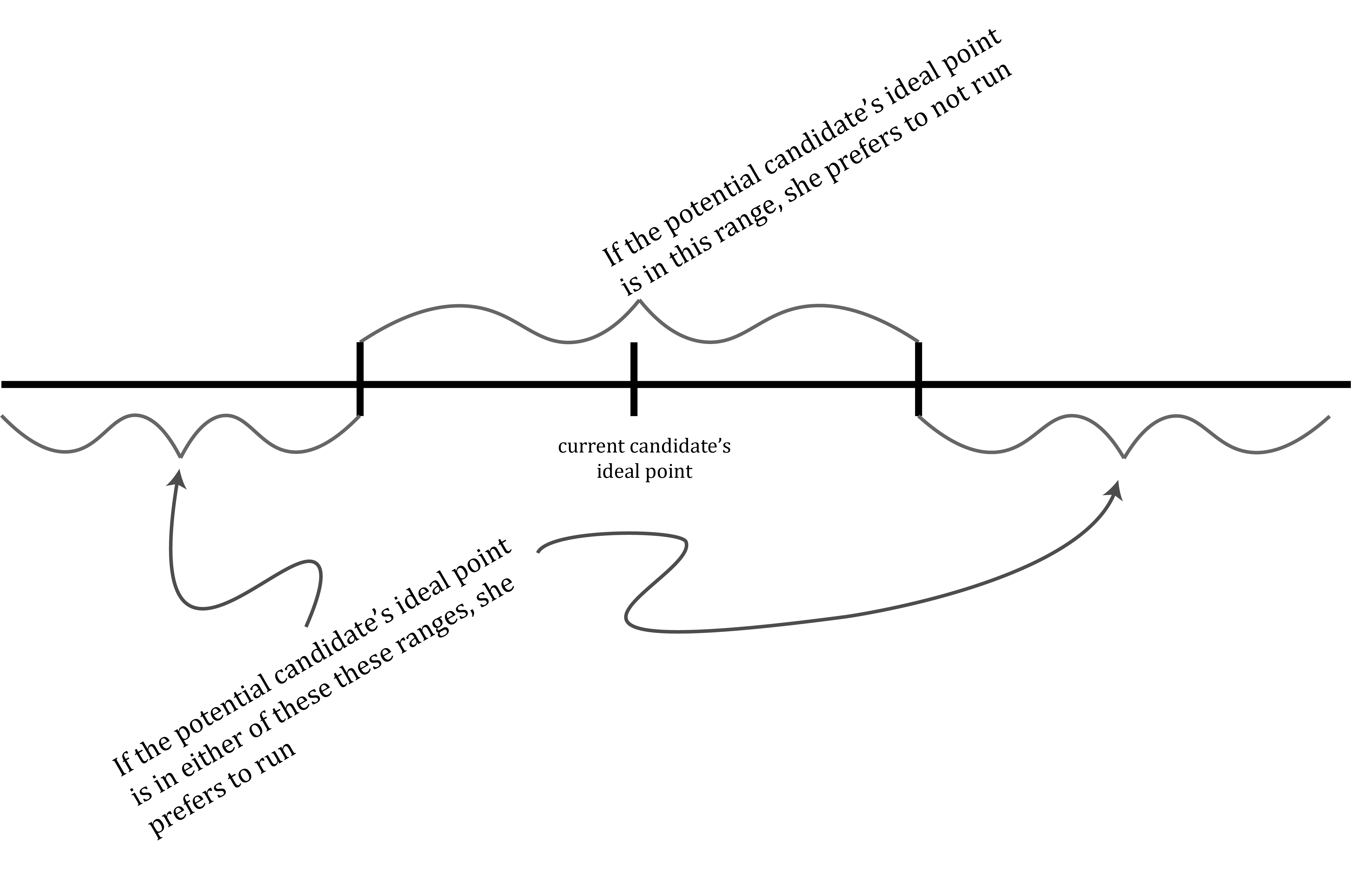
Richard Hall derives the same implication from a similar model: Candidates are only willing to bear the costs of running for office if the effect they will have on policy if they win is large. This, Hall claims, suggests a mechanism through which the “first filter” of elections – the filter determining which persons eligible to run for election actually run – contributes to political polarization. Only persons with relatively extreme policy preferences are willing to bear the costs of running for office, because only extreme candidates would have a large impact on policy if they win. Persons with more moderate preferences, on the other hand, do not disagree much with policies that already prevail. Thus they find the costs required to run as a candidate far greater than what they would gain by changing policy to fit with their own views.
Pause and complete check of understanding 7 now!
References
Bonica, Adam. 2014a. Database on Ideology, Money in Politics and Elections: Public Version 2.0 [Computer File]. Stanford University Libraries. https://data.stanford.edu/dime.
———. 2014b. “Mapping the Ideological Marketplace.” American Journal of Politcal Science 58 (2): 367–86.
Fenno, Richard F. Jr. 1978. Home Style: House Members in Their Districts. Little, Brown.
Grim, Ryan, and Sabrina Siddidqui. 2017. “Call Time for Congress Shows How Fundraising Dominates Bleak Work Life.” Huffington Post Last updated December 6, 2017. https://www.huffpost.com/entry/call-time-congressional-fundraising_n_2427291.
Hall, Andrew B. 2019. Who Wants to Run? How the Devaluing of Political Office Drives Polarization. the University of Chicago Press.
Footnotes
All candidate names, party affiliations, election outcomes and modeled CFscores for the 2014 U.S. House elections displayed in this lesson are taken from Bonica (Bonica 2014a).↩︎